Bottle Designs
Project Brief
This Project was a packaging label project. Designed for us to create fully fledged 3D models for our designs while designing towards the bottles shape, contents and overall group that would be more likely to purchase the product. Whilst keeping in mind the idea of a set of three as the theming scheme. The problems that needed to be solved within this project include procuring bottles to mock up the design, having an understandable and clearly depicted theme, and properly catering to the audience what kind of drink you have and the age range it is more than likely for.
What I hoped to achieve in this project was to meet the overall criteria while being able to feel accomplished and liking my designs that I land on. I want to get a clean design that fit my bottle and advertises well to the intended audience of my choosing. To make it look like I really could have possibly just plucked this off a shelf at the store.
Initial Sketches
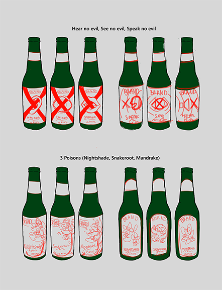
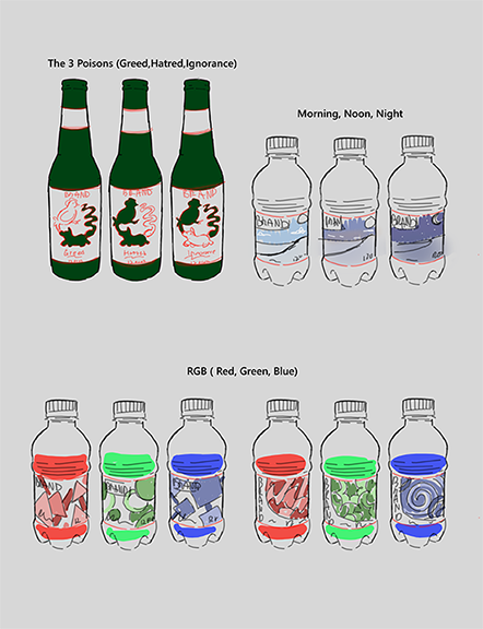
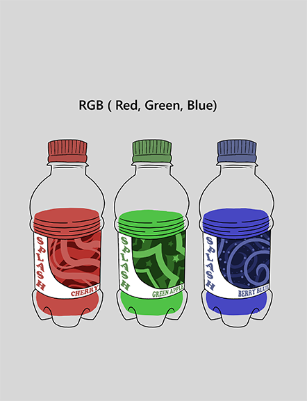
My process work begins with a set of 8 sets of three sketches following along a theme of three to try and decide my overall topic. I played with the themes of: Hear no evil, see no evil, and say no evil; 3 poisons; the three poisons of buddhism; Morning, moon, and night; and lastly RGB.
From here I pick out my top three sets to move foward with and clean up to try and whittle down further. I end up choosing one of almost every set excluding the one that reflects the time and the other that is based upon the three poisons in buddhism.
Secondary Sketches
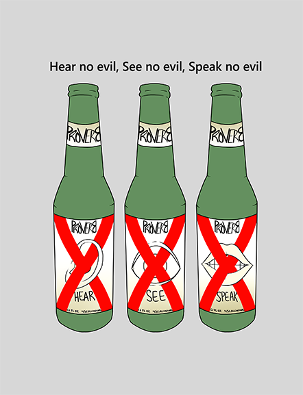
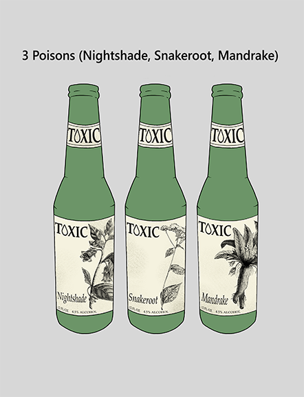
Than I follow into my next set sketches. Focusing in more detail on the ones I had picked out from my last batch. Going into more details and really exploring the possible layouts I could take. Building them out really flatly but clearly for myself and for others so I could recieve proper critique and get my thoughts out on paper. TO decide which idea I was truly gravitating towards.
I ended up finding myself more excited for my RGB theme. The bright poppy colors made me really want to dig into the design as I could picture a really fun kids drink in my head. I even had the perfect bottles at home to work with when it came down to making physical comps of the design.
Initial Digitals
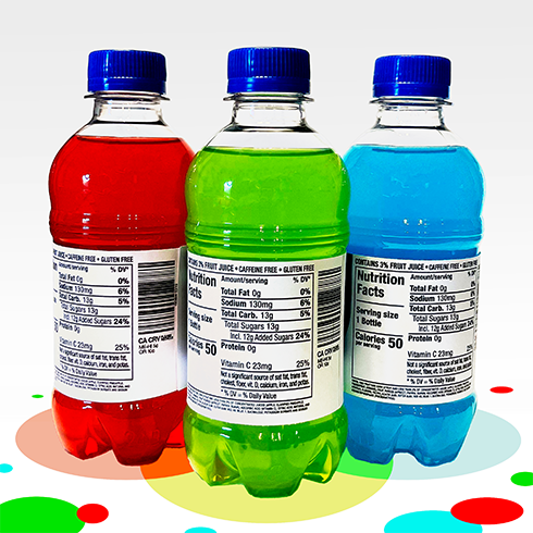
Knowing which set of bottles I want to design I move from sketches to actual vectors. Making sure I take proper measurments of my bottles so that I can have them be the appropriate height and width. As well as researching a hefty amount of kids drinks to ensure I had the needed label and details most kids products may have.
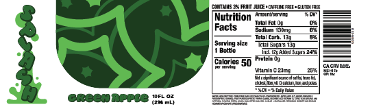
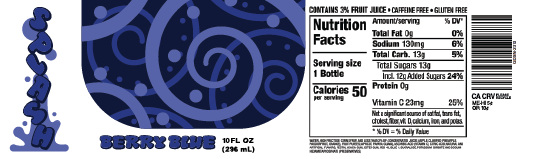
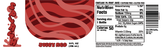
With all of that in mind I create my sketches into digital versions copying my original design I had in my head into a cleanre format. Adding on all the labels and barcodes any product may have. The patterns directly copied from the sketches I initially did as I liked the overall shapes and flow each had. Simply making them higher quality and testable for proper print.
Secondary Digitals
Moving into a second set of digitals I knew there were some corrections that needed to be made. For one my original placement of the brand name was just off. As interesting as it was to the side it needed to be more centered for the product placements sake.So that if it were to be marketed on a shelf it could clearly be seen and stand out as a large focal point.
So with that in mind I had to edit my main pattern design so that it would take up more space and hold my brand name inside it well. I wasnt quite happy with how this was looking. Finding my current font choice in the right veing of roundness and playful; But incredibly hard to read with how I had it on the bottles. Knowing that in my next round of digitals I would need to at minimum change the color and spacing a bit.
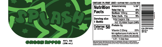
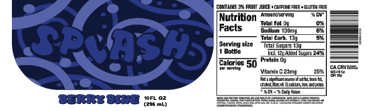
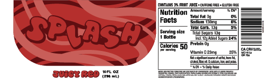
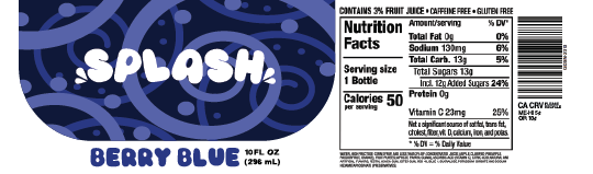
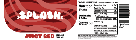
Final Digitals
This will be my final set of digitals happy with the overall look of the bottles wrapper. I ended up scraping my previous font entirely and finding another that fit the bubbly fun kids drink look I was aiming for. I edited it some so that the forms were overall better to look at and made the text a bright white so it really popped out from the pattern.
This resulted in with what I considered a finalized look. Leaving me to finish cleaning it up and making sure all my forms were smooth and made just right. Not wanting any stray points to be what gives my product a unfinished look. As well as a large series of test prints to ensure I get the colors I want when I make comps of my product.
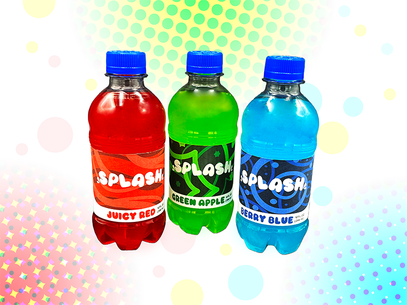
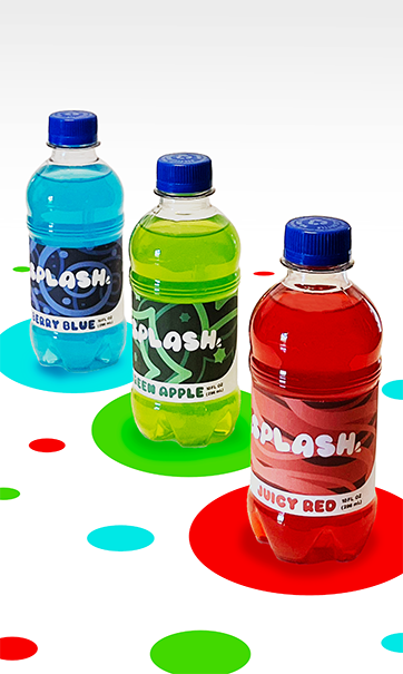
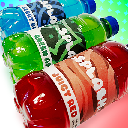
End Result
Lastly all I needed to do was put my labels onto some actual bottles. The ones I had looking perfect with them on even more so with the brightly colored fruit punch that was in them really tying it all together. Giving it that bright punch and bubbly look that any sweet kids drink might have.
I took some pictures in a makeshift setup than dragged those images into my photoshop. Working to render them and really focus on the colors and brightness. Making it seem friendly and playful as though I was really going to market these towards kids. Giving them a fun athmosphere and highlighting the design.
Conclusion
This project was a rather fun one for me. I enjoyed the overall theming I went for and the ability to play with such bright colors and compositions while also still making it feel like something I could possibly do proffesionally given the oppurtunity. Feeling I made a product that you could realistically find on shelves at your local stores. All in all I think Im rather satisfied with the outcome of my project and I would be welcome to doing a similar one again even if its in my own free-time.